Pages

Showing posts with label blog tour. Show all posts

Thursday, March 28, 2019

Yogi: The Life, Loves, and Language of Baseball Legend Yogi Berra - a review

It's baseball seasonmy favorite season of the year! What better way to kick off the season than with a review of a new baseball book? I'm no Yankee fan—anyone who knows me in person or online will attest to my affinity for the Phils, but it's hard not to admire Yogi Berra.


Yogi: The Life, Loves, and Language of Baseball Legend Yogi Berra
By Barb Rosenstock
Illustrated by Terry Widener
Calkins Creek, 2019

In this picture book for older readers, Barb Rosenstock offers a well-rounded look at baseball legend, Yogi Berra. Yogi is well-known for his many unintentionally humorous quotes, or "Yogi-isms," but no one would know of these if it were not for his phenomenally successful baseball career.  From childhood to retirement, Rosenstock shows that there was more to Yogi than skill and humor. Yogi was short, unattractive, and the son of Italian immigrants during a time when that was often a cause for ridicule or discrimination—but that did not hamper his good nature, determination, or enthusiasm for baseball.  When fans or players taunted him for being ugly,
"So?" Yogi said. "I don't hit with my face."  He ignored the name-calling and let his bat do the talking.
Yogi loved his family, his friends, his country, and baseball. Terri Widener's acrylic illustrations eschew details in favor of creating illustrations that convey the mood or action of the the text on each page. The text is unobtrusive in a small black font, however, "Yogi-isms" appear in larger blue font with quotation marks. In most illustrations, Yogi is closely outlined in white, presumably so that kids will easily be able to pick him out of each illustration. Widener captures Yogi's endearing personality and his baseball prowess and acumen.

Author's Note, photographs, statistics, quotes, Bibliography, and Source Notes round out this picture book biography for older readers.  Sure to be a hit for baseball season—especially for Yankee fans.

Some Yogi: The Life, Loves, and Language of Baseball Legend Yogi Berra extras are below.


Peek inside Yogi here.


According to USA Today Sports, Yogi once said, "I’m lucky. Usually you’re dead to get your own museum, but I’m still alive to see mine."  If you're ever in the neighborhood of Little Falls, NJ, you can check out the Yogi Berra Museum and Learning Center, too.
 My copy of Yogi: The Life, Loves, and Language of Baseball Legend Yogi Berra was provided by the publisher.

Friday, April 6, 2018

Kalinka and Grakkle - three questions with Julie Paschkis


Kalinka and Grakkle
by Julie Paschkis
Peachtree, 2018


Welcome to the final stop on the Kalinka and Grakkle blog tour.  I don't do many blog tours, but I love the artistic style of Julie Paschkis and so am pleased to participate. Her combination of ink and watercolors combines humor with a delicate and detailed art form reminiscent of Ukrainian psysanky

Julie Paschkis was kind enough to answer three questions for me. 
Q: In the author bio for Kalinka and Grakkle, it notes that, "One day, Kalinka flew into Julie's studio when she was rewriting the story "Goldilocks and the Three Bears."  Always helpful, Kalinka turned it into a story about herself (and Grakkle)."  Was that a metaphorical bird that flew into your studio, or an actual one? If it was a real one, I'd love to know what species. (I love birds!)

 A: The bird that flew into my studio was a metaphorical bird. I called her Goldibird at first; the seed of her character was Goldilocks. I always wondered why Goldilocks felt entitled to make herself so at home in someone else’s house. Goldibird was bossy - she just took over everything. I realized that she felt entitled because she thought she was helpful. She was self deluded as well as bossy, but she always meant well. Once the bears were kicked out of the story I renamed her Kalinka. I have had a real bird fly into my house (years ago). I caught it with a big soft towel and then released it back outside. Maybe it left the seed of an idea.

 Q:Just curious, although he's not a bird, is Grakkle's name a reference to the (messy) common grackle?


A: When I imagined what the beast would sound like,  “Grakkk” came to mind. It’s an outraged sound, and a funny sound - not a scary sound. So I called him Grakkle. The name of the bird- grackle -comes from the Latin graculus and means crow or jackdaw.  I guess that the word also originally came from the sound.
 
Q:  Like many librarians, I review picture books even though I am not an artist.  I try to learn as much as possible about picture book art via informational books, webinars, reviewer chats, and title page information.  As an author/artist, please tell me (and other reviewers) what aspects of a book do you wish we'd give more attention; or what do reviewers often miss?  (to which the polite and diplomatic Julie Paschkis replied ...)


A.  I don’t feel that there is any specific or general thing that reviewers miss. People brings their own stories to the experience of reading a book. I put in as much as I can of my story, but the experience of reading and looking at it will be different for each person. That’s a good thing!

Read and excerpt from Kalinka and Grakkle here.  Kids will surely enjoy this odd-couple friendship story.


Previous stops on the Kalinka and Grakkle blog tour:

Monday, February 27, 2017

Stanley's Store - a review

I first met Stanley at the farm in 2015.  It was love at first sight. Peachtree Publishers calls him "the hardest working hamster in the book business." Today I'm pleased to participate in a blog tour for Stanley's latest gig as a storekeeper.


Stanley's Store
by William Bee
Peachtree, 2017

With simple text,
It's going to be another busy day at Stanley's Store,
and vivid colors outlined in black against a white background,


Stanley's Store is perfect for very young listeners—but there is much more to like.  There are myriad opportunities to explore shapes, colors, numbers, and food groups while sharing this and other Stanley books. There is also some light humor, as when silly Charlie spills Stanley's fruit display and ends up with a banana on his head.  Stanley's Store spans the course of a day, so the concept of time is included as well.  The day begins with the delivery of produce to the store, proceeds to shopping, and ends with supper, bath, and bed - a recurring theme in the series.  A sturdy cover and substantial pages complete the cheery story. 😊
 
View an excerpt from Stanley's Store here.

Previous Shelf-employed reviews of Stanley books:


Bee, William. 2015. Stanley the Farmer. New York: Peachtree.
Stanley is a hardworking hamster. Illustrations and text  are bright and simple, making Stanley a perfect choice for very young listeners. Along the lines of Maisy, but with a crisper, cleaner interface.  Nice size, sturdy construction.

When I next encountered him, he was offering a small and sturdy look at colors and shapes.

Stanley's Shapes by William Bee
Peachtree Publishers, 2016

William Bee's illustrations are crisp, bright and simple. In Shapes, he ensures that the featured shape on each double-spread page is easy for children to discern, outlined heavily in black.   There are 8 shapes in all, and each one is something that should be easily recognizable for a child.  A tent is a triangle, a window is a square, bike wheels are circles, a kite is a diamond, etc. Text is minimal for each shape,
Wheeeeeeee! Circles make the best wheels!
Preceding the simple, black text is a white outline of the featured shape.  The final spread is an illustration that contains all of the shapes,
What a lot of shapes! How many can you see?
Stanley's Shapes is exactly what a concept board book should be.


Stanley's Colors by William Bee
Peachtree Publishers, 2016

Like Stanley's Shapes, Stanley's Colors is a perfectly simple, child-sized, concept board book.  There are eight featured colors on double-spread pages.  The background is white, except for a colored banner on the bottom.  The colored banner contains the simple black text,
Choo Choo!  Here is Stanley driving his purple train.
and matches the color in the illustration.  Almost everything in the image is purple with the exception of Stanley, and a few small accents.  Black outlining ensures clarity.

If you're looking for a color concept book for very young kids, this is a great choice.

Note:
My copy of Stanley's Store was provided by the publisher at my request.

Monday, October 26, 2015

New Jersey - The 50 States Fun Fact Blog Extravaganza!

New Jersey knows that it's the butt of jokes throughout the nation, but we also know that we've got a great state with unique features that no other state can match.  From the mountains to the shore, from the cities to the Pines, we've got a wealth of natural beauty, history, and culture.  It's like a well-kept secret.  But now, The Fifty States: Explore the U.S.A. with 50 fact-filled maps, written by Gabrielle Balkin and illustrated by Sol Linero (Quarto, 2015) is bringing some of our secrets to light.


Take a peek at the New Jersey page, and then I'll share a few of my favorite NJ gems.


Three of my NJ favorites which are featured in The Fifty States: Explore the U.S.A. with 50 fact-filled maps:
 BRIGHT IDEA In West Orange you can visit inventor Thomas Edison’s lab and house.
Thomas Edison National Historical Park is a fascinating place to visit.  In my opinion it beats visiting Thomas Edison Center in Menlo Park, NJ and his winter estate in Fort Myers, Florida.  He didn't just invent the light bulb, he invented everything you need to use a light bulb - from the lamp to the power grid.  And of course, he invented much more than the light bulb.  Not a perfect man, by any means, but a perfectly brilliant inventor!
"Edison labs Main St Lakeside Av jeh" by Jim.henderson - Own work. Licensed under CC0 via Commons - https://commons.wikimedia.org/wiki/File:Edison_labs_Main_St_Lakeside_Av_jeh.jpg#/media/File:Edison_labs_Main_St_Lakeside_Av_jeh.jpg

LUCY THE ELEPHANT In 1881 the U.S. Patent Office granted inventor James Lafferty the right to make animal-shaped buildings for 17 years. His first creation, Lucy, still stands in Margate, Atlantic City.
She's a whopping 6-stories high and 134 years old, and she sits right next to the beach.  And what a view from inside!  I'm not positive but I do remember that her interior paint color is "stomach," or something similarly intestinal.
By Harriet Duncan (Own work) [CC BY-SA 3.0 (http://creativecommons.org/licenses/by-sa/3.0)], via Wikimedia Commons
FEBRUARY 1913: Silk workers in Paterson begin a six-month-long strike for better working conditions.
Paterson, NJ, may not be your first thought when seeking tourist sites, but it's well worth a visit.  Paterson Great Falls National Historical Park is one of the nation's newest National Parks. The falls (one of the largest in the nation) and park sit in the midst of an urban city of more than 145,000 people. The falls and the people of Paterson were powerhouses of the U.S. Industrial Revolution.
Photo by L Taylor (c)
If you want to know more great sites in NJ, you'll have to come see for yourself. (BTW, Come See For Yourself, was once our state slogan. I think they should have gone with the more popular, "New Jersey - You got a problem with that?")

Note:
Book images and quotes were provided by the publisher.  I have no publisher or bookseller affiliations and received no compensation.  I am participating for love of state.

Tuesday, August 18, 2015

Fab Four Friends - the blog tour

Today I'm happy to share in the celebration for the publication of Fab Four Friends: The Boys Who Became the Beatles, written by Susanna Reich, illustrated by Adam Gustavson, and published by Macmillan.

Author Susanna Reich has written an inspiring book chronicling the early years of John, Paul, George, and Ringo. Each is highlighted in turn with a focus on the events and people that shaped his future and his interest in music.

The final pages feature the band's early successes.  Readers will be impressed by the boys' dedication to their musicianship and their ability to overcome family tragedy, illness, and in John Lennon's case - a lack of musical training and a guitar that his mother taught him to tune like a banjo.

John attacked the guitar, strumming as fast he could.  He didn't give a fig about wrong notes.

Eventually Paul traded in his trumpet for a guitar.  From then on, his brother said, "he didn't have time to eat or think about anything else."

At school, George sat in the back and drew pictures of guitars. But when it came to practicing, no one was more serious.

Back home, Richy [Ringo] couldn't stop his hands from tapping.  Listening to all kinds of music—country and western, jazz, blues, skiffle—he'd rap on the back of a chair, bang on a box, or pound an old bass drum with a piece of firewood.

The text is small and in simple font on a plain background, leaving ample room for Adam Gustavson's stellar illustrations in "oil paint on prepared paper."  It is a difficult task to render likenesses of these four men who are known and revered the world over.  Gustavson has done a remarkable job in capturing their youth, signature expressions, and intensity of mood. In quiet acknowledgement of the post-war era that engendered the rise of rock and roll, the book opens with double-spread illustration of "a dark October night in 1940," the night when John Lennon was born in the midst of war with Germany. The final double-spread is the one that appears on the book's jacket.

More illustrations from Fab Four Friends are on the publisher's site.

Rounding out Fab Four Friends are an Author's Note, Glossary (I'm sad that phonograph needs to be in the glossary!), Notes, and Sources.

I asked only one interview question of author Susanna Reich. With so many songs to choose from and her obvious love of her topic, I knew it would be a tricky question:
Q: "What's your favorite Beatles tune?"

It sent her to her headphones for an hour of listening. Her final answer:
A: "Let it Be."
It's certainly hard to argue with that.

The publisher's site lists a suggested age range of 6-10.  I think older kids, particularly those with musical inclinations will be interested in this one as well.


Note:
 A book's case and jacket are often (usually) the same.  Library books are typically processed with protective coating on the jacket that secures it to the cover. So, if you're a librarian, or a library user, you may never see the books' case.  If possible, however, take a peek under the jacket of Fab Four Friends. The front cover features individual portrait style paintings of Paul, John, George, and Ringo.  They appear youthful and suited and are presented in square frames reminiscent of yearbook photos or 1970s era Beatles posters. They are joyful and boyish - four fab friends.

My copy of Fab Four Friends was provided by the publisher.  You can find yours on a library or bookstore shelf, beginning today, August 18, 2015.

Follow the blog tour for Fab Four Friends: The Boys Who Became the Beatles.  Tomorrow, the tour will stop at UnleashingReaders.com .


Happy book birthday to Fab Four Friends!


Thursday, May 21, 2015

Feet, Go to Sleep - a review

Welcome to the final stop on the Barbara Bottner blog tour for her latest book, 
Feet, Go to Sleep, illustrated by Maggie Smith and published by Alfred A. Knopf.


Fiona has spent the day at the beach and now it's time for bed.
"Time to say good night," said Mama.
"I'm not ready!" said Fiona.
"You've had a long day.  You must be tired, from your head to your toes," said Mama.
"Maybe just a little tired...."

This may be a bedtime story, but Maggie Smith's bright illustrations are richly colored and full of life. 
"Toes, go to sleep!" said Fiona.
Toes were for gripping flip-flops on the way to the beach.
Toes were easy.  They went right to sleep."

The illustrations feature bright and bold depictions of Fiona's earlier daytime activities, while the pajama clad Fiona is contrasted in a smaller inset box, growing wearier with each page until she is finally and peacefully asleep against a backdrop of evening blue.  Feet, Go to Sleep is an attractive combination of enjoyable and practical.

Although I was traveling, and did not have time to submit interview questions to author Barbara Bottner, she was kind enough to answer one question for me.  As a Jersey Shore gal, I was curious if Feet, Go to Sleep is based on any particular beach - perhaps one of Ms. Bottner's favorites. Bottner enjoyed frequenting Jones Beach on Long Island as a teenager, however, the location of Fiona's activities are not based on any specific beach, In fact, the book's location was added after the first draft. I have actually (succesfully) used the relaxation technique in Feet, Go to Sleep many times, although I've never needed it after a day at the beach. For me, a day at the beach is a relaxation technique in itself.  Ah, that salt air!

Previous stops on the blog tour include:
Feet, Go to Sleep by Barbara Bottner
Blog Tour Schedule


My copy of Feet, Go to Sleep was provided by the publisher.

Wednesday, October 16, 2013

The Snatchabook blog tour

Thanks to the interns at Sourcebooks, I'm excited to be a part of The Snatchabook blog tour. The Snatchabook is a skillfully rhymed bedtime story featuring the cutest little villain, a Snatchabook. The illustrations are cheerful but nuanced, and will offer many details to discover as the book is shared again and again.  It's sure to be a bedtime favorite.

The Snatchabook's author, Helen Docherty, has graciously accepted an offer to answer a few questions.

Lisa: The Snatchabook has put me in a lighthearted mood, so here are a few lighthearted questions!
 Snatchabook is such a cute name.  Was it the seed that started the story, or did it grow from the story?

Helen: The idea of a book thief came to me first, and it was while I was trying to find the right name for him that the character and the story started to form in my mind. At first I wasn’t sure what he would be like, or what to call him, so I played around with names; the book cruncher? The book snatcher? These seemed to suggest quite a menacing character, which wasn’t at all what I wanted, so I tried inverting the words - and that’s when the Snatchabook was born. As soon as I had named him, an image started to form in my mind of a pitiful, lonely little creature who just needs someone to read to him – hence his desire to steal books, which symbolize to him the joy and warmth of sharing a story at bedtime. So I guess you could say that the name and the story came together.

Lisa: Helen, did you leave Thomas (Docherty) alone to illustrate the story as he imagined it, or could you not resist giving suggestions? (I know that I would have a hard time resisting!)

Helen: To be honest, it would have been impossible to resist, given that we see each other all the time (or at least that’s my excuse)!  Actually Tom was more than happy to discuss the development of the characters and the setting with me – it was a very collaborative process, and we had lots of fun discussing how the Snatchabook and Eliza would look. Of course, he added many visual details that I could never have dreamed up, all of which greatly enhance the story. He always asks me for feedback at every stage of the illustration process, just as I read him my stories and seek his advice. It’s great to have a critical eye / ear available around the clock!


Lisa: What were your favorite bedtime stories when you were young?

Helen: There are too many to choose from! Some of my best early memories are of being read the Winnie the Pooh stories and being convulsed with laughter. I also loved a series about a panda pajama case called Ponder, the My Naughty Little Sister stories and a Norwegian series by Anne-Cath Vestly about a little girl called Aurora and her family. Favorite picture books included The Bear’s Winter House (by John Yeoman and Quentin Blake), The Giant Jam Sandwich (by John Vernon Lord and Janet Burroway) and The Grinch Who Stole Christmas. I was a huge fan of Russell Hoban’s Frances books, too. Luckily, I managed to hang on to most of my favorite books from childhood, and it now gives me enormous pleasure to read them to my own kids. I hope I can keep doing that for as long as possible.

(The Snatchabook has apparently snatched all of Helen's favorites!)

Lisa: How wonderful will it be when your children can read The Snatchabook to their children?  You don't have to answer that one.  I think I can imagine!

Helen: Our five year old daughter Lucia read it to us the other day – or rather, to the gorgeous Snatchabook puppet that Pippa Curnick at Alison Green Books (our UK publishers) made for us. Lucia is just learning to read, but she knows the words almost off by heart. So that was a very special experience indeed!

Lisa: Such a fun story.  I can't wait to try it out in story time at the library! Thanks so much for the opportunity to chat with you,


Visit The Snatchabook's website to snatch up an Educator's Guide and Activity Kit.


My copies of the Snatchabook were provided at my request by NetGalley and Sourcebooks.

Monday, May 7, 2012

Minette's Feast - an interview with Chad Beckerman

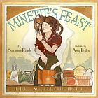
Today I have the pleasure of welcoming Chad Beckerman. He is here in his capacity as Creative Director for Abrams Books for Young Readers, to talk about the newly released Minette's Feast: The Delicious Story of Julia Child and Her Cat, written by Susanna Reich, and illustrated by Amy Bates.


Lisa: Although I did ask to interview the editor of Minette’s Feast, I did not anticipate interviewing the Creative Director for Abrams books.  When I looked you up online, I admit to being more than slightly intimidated by your very impressive resume.  I’m interviewing the art director behind the wildly successful Diary of a Wimpy Kid and Origami Yoda series? Peter Nimble and His Fantastic Eyes? The artistic muse behind Escape! and my new favorite, Huff & Puff?   Be still, my nervous heart.  Please forgive me in advance for my lack of knowledge in your area of expertise and allow me to quote one of my favorite lines from Mary Rose Woods', The Mysterious Howling, "all books are judged by their covers until they are read."

So, on we go …

Chad: Wow, you really have done your Designer research!  I am the evil design mastermind behind all of those books!

Lisa: Minette’s Feast– a superbly written narrative by Susanna Reich paired with the pencil and watercolor paintings of Amy Bates that exude the aura (and aroma!) of a 1950s French kitchen.   Was it you who brought these two talents together?  How do you choose an illustrator for a manuscript?  Was there ever a case where you’ve found artwork that sent you in search of a writer?

Chad: Tamar Brazis, editorial director, and I had worked with Amy Bates on two other picture books, The Dog who Belonged to No One and A Bear in the Air. We had been on the search for a picture book for Amy. When Susanna's Minette's Feast came across Tamar's desk, we knew without question this was a book for Amy. In most cases we have a manuscript and will search for just the right illustrator. Thankfully we had Amy stowed away for a rainy day.


Lisa: I understand that you have designed all of Amy Bates’ books for Abrams. You must be quite familiar with her and her work.  Does that make your job easier?

Chad: Being familiar with an illustrator's work definitely makes an art director's job easier. You know what their strengths and weaknesses are. You know where and when to push them to get better work from them. In the case of working with Amy, our first book we worked on together was The Dog who Belonged to No One. I had seen Amy's work on a few other pictures from our houses so I had an idea of what she could do. I wanted to make the books that she did with ABRAMS different than her other work. To solve that idea, we pushed Amy into creating designs and patterns that fit the content of the story; in turn giving the viewer more to look at than just full bleed or spot illustrations.  These border designs helped bring you into the time period of the story.

Lisa: Your job is to create an overall  “vision” for the book, to give it a particular “feel,” how do you affect that vision?  Within the pages of the book itself, is it primarily a matter of space and placement, typeface and font,  or is there more that you can do to achieve a particular effect? 

Chad: The first way a designer helps create his or her vision on the book is through his font choice. I feel this helps set the mood or time period for the story. Designers need to ask themselves, is this book wacky and deserves a more fun take on the typography, or does the typography need to be played down to let the art be the main star? Is this an historical book where a typeface from that time period or region might be the best choice?  This is the question I asked myself for Minette's Feast. I searched mainly for fonts that said "Paris" to me. This choice helped set the stage of where the story takes place, perhaps hinting at the atmosphere of the text.


The second way a designer or an editor helps create a vision for a particular book is working with the illustrator to shape the look of the book. For example we spent a lot of time working with Amy getting a few spreads to work exactly right.


As you can see we had to reshape the sketches so they worked better with the text and told the story better.

Lisa: How involved are you in the early sketches or color studies?  I saw the many transformations that occurred in the making of Peter Nimble and His Fantastic Eyes.  How do artists feel about going “back to the drawing board" for so many iterations? Are most cooperative?

Chad: I am very involved in the early stages. In a cover like Peter Nimble and His Fantastic Eyes, I had a idea of what I wanted the cover to be before hiring Gilbert Ford; but I also knew it might not be the right idea so I wanted to see what ideas Gilbert had.  This was definitely a long process - one that Gilbert stuck by me with.  No one likes to have to go "back to the drawing board." It helps to be very transparent about what is going on. Artists are not in the office with you; they don't hear the reasons why a cover or illustration is not working for someone. Not being part of that process can be hard since an illustrator can feel on the outside of the process. It's my job to make sure they don't feel that way.

Minette sketches
Julia sketches


Lisa: Why choose different artwork for the book’s cover and its dust jacket?  I love them both, but I am curious. Don’t picture books usually have the same cover art and dust jacket?

Chad: I find that you are correct that picture books tend to have the same case as the front jacket image. I find this a bit lazy from the designer's point of view. I say this because I am guilty of just placing the cover on the case as well. More and more, I find that designing the case with new art offers up a little something extra to help the book feel more special.

Lisa: Were the endpapers your idea?  I love the tablecloth motif.

Chad: Amy had made the end paper art for the copyright spread, I believe. The art that is now on the copyright spread was originally intended as the cover illustration. During the process of working out the pagination of the text/illustrations, we moved the tablecloth pattern to the end papers. It was just too good not to use.


Lisa: What do you feel is your greatest contribution to Minette’s Feast?

Chad: My greatest contribution is working alongside Tamar Brazis. Our teamwork is an accomplishment. We sit down, go over the sketches, and shoot ideas off each other, helping the book to grow into what it wants to be. This relationship adds to the quality of our books and Minette's Feast. But, if you are asking what is my favorite part of the book, I am quite fond of the case and endpapers, but you have already pointed those out.


Lisa: Finally, I’m curious – are those “brass knuckles” on your coffee cup?


Chad: Those are indeed brass knuckles attached to, yes, my coffee cup. Oddly, there has never been any coffee in that cup.

Lisa: Thanks so much! I've truly learned a great deal - about Julia Child, of course, and about picture books in general.  Until this interview, I never gave much thought to the art director's contribution, being more of a wordsmith than an artist, myself.  Writer, artist, editor and art director - together you've created a delicious offering in Minette's Feast,

Ooh-la-la! Magnifique!

The blog tour wraps up tomorrow at Readerkidz.

Today's Nonfiction Monday roundup is at The Swimmer Writer.

Monday, April 30, 2012

Monday Morning Miscellany v.3

It's Nonfiction Monday again (where do the weeks go?) and because I'm busily working on several projects, it will be a Monday Morning Miscellany edition.

    First up, the Nonfiction Monday roundup is at Gathering Books today.  If you're a fan of nonfiction or want to be, stop by and check out the great posts. 

Next on my agenda, the Minette's Feast blog tour begins today at Anastasia Suen's BooktalkingMinette's Feast: The Delicious Story of Julia Child and Her Cat, due next month on a shelf near you, tells the story of Julia Child vis-à-vis her cat, Minette. (I'm sure that throwing French around is de rigueur in a discussion of Julia Child)   The blog tour will feature reviews, interviews and guest posts.  I am most excited that the blog tour will stop here next Monday, when I will get to interview Chad Beckerman, art director for Abrams Books, publisher of Minette's Feast, and all-around creative genius or "evil design mastermind," depending on whom one asks! ;)

The Hobbit - I'm thrilled that a (hopefully) good version of The Hobbit is finally in production. The Hobbit and the LOTR trilogy have been on my list of favorites since I was a teenager. The movie trailer looks great -


but as a purist who still bemoans the fact that Tom Bombadil was left out of the movie version of LOTR, here's what I'm wondering: Why does the IMDB cast list include Cate Blanchett as Galadriel and Evangeline Lilly as Tauriel?  First of all, there are no women characters in The Hobbit - zilch, nada.  And Tauriel?  Who the heck is that?  Just venting.

And finally, if you haven't heard the "dirt" on The Dirty Cowboy, or specifically on Adam Rex's illustrations for The Dirty Cowboy, check out the brouhaha here, and here and here.
"The Dirty Cowboy by Amy Timberlake A filthy cowboy, a bath, and a wrestling match with a dog. This one has it all."
From the book's description on Adam Rex's site.

Oh, c'mon, school board, where's your sense of humor?


That's it for today.  Have a great week!

Monday, January 30, 2012

Monday Morning Miscellany

First up,
  • It's Nonfiction Monday again.  Please be sure to visit host, Wendie's Wanderings to read today's posts. I've got no reviews to offer today, however, I did read this book yesterday and loved it for its beautiful photos, sweet story, and simple sentence structure (perfect for sharing with little ones at storytime):
(Be assured that the quality of the book's photos exceeds the quality of the book trailer video.)  A curiosity about this decidedly nonfiction book - the copyright page lists the classifying subject headings as the following:

1. Orangutan – Juvenile fiction. 2. Dogs – Juvenile fiction. [1. Orangutan – Fiction. 2. Dogs – Fiction. 3. Wildlife refuges – Fiction. 4. South Carolina – Fiction.]
I sent a note to the publisher to inquire if this is an error or a choice, but haven't had a response yet.  This is not the first time that I've seen erroneous cataloging information in print.  Can someone who is familiar with publishing enlighten me as to the source of the classifications?  I'm a curious sort. 

Next,
  • After many, many tries, I was finally successful in logging in to my White House account and signing the petition to  
Ensure that every child in America has access to an effective school library program.
If you haven't signed the petition, please do.  (You must create a White House account before signing.)  The log in process seems to be temperamental.  Please keep trying!  As I'm writing, 4411 signatures are still needed by February 4, to ensure a response from the President. Do yourself, your children, your students, your school, and your community a favor and support strong school library programs.

Finally,

Ms. Vaughan's visit here is part of the larger Sydney Taylor Book Award Blog Tour 2012.  The tour kicks off on February 5 with the following: 

Susan Campbell Bartoletti, author of Naamah and the Ark at NightSydney Taylor Honor Award winner in the Younger Readers Category
at Ima On & Off the Bima

Holly Meade, illustrator of Naamah and the Ark at NightSydney Taylor Honor Award winner in the Younger Readers Category
at
Into the Wardrobe

Shelley Sommer, author of Hammerin' Hank Greenberg, Baseball PioneerSydney Taylor Honor Award winner in the Older Readers Category
at
Great Kid Books

The complete schedule is available at the Association of Jewish Libraries blog, "People of the Books."  Follow the tour and support the authors and illustrators of this year's winners!

Have a great week!

Thursday, February 3, 2011

Sydney Taylor Book Award Blog Tour

Just a reminder that the Sydney Taylor Book Award Blog Tour starts this Sunday.  The Sydney Taylor Book Award and honors are "presented annually to outstanding books for children and teens that authentically portray the Jewish experience."

The blog tour kicks off on Sunday, February 6, right here at Shelf-employed, along with stops at Biblio File and Jewish Comics

SUNDAY, FEBRUARY 6, 2011 tour schedule


  • Carla Jablonski, author of Resistance, Sydney Taylor Honor Award winner in the Older Readers Category at Jewish Comics
  •  Leland Purvis, illustrator of Resistance, Sydney Taylor Honor Award winner in the Older Readers Category  right here @ Shelf-Employed 
  • Sarah Gershman, author of Modeh Ani: A Good Morning Book, Sydney Taylor Honor Award winner in the Younger Readers Category at Biblio File


All the blog tour stops, dates and details are available at The Association of Jewish Libraries Blog.

See you Sunday!

Beneath the Waves - a review

As we read disturbing news accounts of dying manatees , environmental disasters caused by toxic waste, and ocean pollution on the scale of ...