Book reviews (and news) you can use. A librarian's opinion on books and media for children and young adults
Showing posts with label food. Show all posts
Monday, May 11, 2020
Now You Know What You Eat - a review
Now You Know What You Eat
by Valorie Fisher
Scholastic, 2019
Below is my review as it appeared in the November, 2019 issue of School Library Journal.
FISHER, Valorie. Now You Know What You Eat. illus. by Valerie Fisher. 40p. glossary, photos. Scholastic/Orchard. Oct. 2019. Tr $17.99. ISBN 9781338215465. K-Gr 3--This vibrant book explains the provenance of many beloved foods (though meats are conspicuously absent). In addition to noting where ingredients such as maple syrup or chocolate can be found, the book delves into the science behind their extraction and creation into edible items. Fisher breaks down familiar foods like peanut butter and jelly, macaroni and cheese, and oatmeal raisin cookies into their most basic elements using photos, simple diagrams, and recipe-like instructions ("yogurt = milk + bacteria"). She also details the sources of milk and methods for procuring and processing it. VERDICT Browsers and those who enjoy almanacs and other nonfiction compendiums of miscellany will appreciate this work.
Reprinted with permission. COPYRIGHT 2019 Library Journals, LLC. A wholly owned subsidiary of Media Source, Inc. No redistribution permitted. http://www.schoollibraryjournal.com/
Monday, February 27, 2017
Stanley's Store - a review
I first met Stanley at the farm in 2015. It was love at first sight. Peachtree Publishers calls him "the hardest working hamster in the book business." Today I'm pleased to participate in a blog tour for Stanley's latest gig as a storekeeper.
Stanley's Store
by William Bee
Peachtree, 2017
With simple text,
Stanley's Store is perfect for very young listeners—but there is much more to like. There are myriad opportunities to explore shapes, colors, numbers, and food groups while sharing this and other Stanley books. There is also some light humor, as when silly Charlie spills Stanley's fruit display and ends up with a banana on his head. Stanley's Store spans the course of a day, so the concept of time is included as well. The day begins with the delivery of produce to the store, proceeds to shopping, and ends with supper, bath, and bed - a recurring theme in the series. A sturdy cover and substantial pages complete the cheery story. 😊
View an excerpt from Stanley's Store here.
Previous Shelf-employed reviews of Stanley books:
When I next encountered him, he was offering a small and sturdy look at colors and shapes.
Note:
My copy of Stanley's Store was provided by the publisher at my request.
Stanley's Store
by William Bee
Peachtree, 2017
With simple text,
It's going to be another busy day at Stanley's Store,and vivid colors outlined in black against a white background,
Stanley's Store is perfect for very young listeners—but there is much more to like. There are myriad opportunities to explore shapes, colors, numbers, and food groups while sharing this and other Stanley books. There is also some light humor, as when silly Charlie spills Stanley's fruit display and ends up with a banana on his head. Stanley's Store spans the course of a day, so the concept of time is included as well. The day begins with the delivery of produce to the store, proceeds to shopping, and ends with supper, bath, and bed - a recurring theme in the series. A sturdy cover and substantial pages complete the cheery story. 😊
View an excerpt from Stanley's Store here.
Previous Shelf-employed reviews of Stanley books:
Bee, William. 2015. Stanley the Farmer. New York: Peachtree.
Stanley is a hardworking hamster. Illustrations and text are bright and simple, making Stanley a perfect choice for very young listeners. Along the lines of Maisy, but with a crisper, cleaner interface. Nice size, sturdy construction.
When I next encountered him, he was offering a small and sturdy look at colors and shapes.
Stanley's Shapes by William Bee
Peachtree Publishers, 2016
William Bee's illustrations are crisp, bright and simple. In Shapes, he ensures that the featured shape on each double-spread page is easy for children to discern, outlined heavily in black. There are 8 shapes in all, and each one is something that should be easily recognizable for a child. A tent is a triangle, a window is a square, bike wheels are circles, a kite is a diamond, etc. Text is minimal for each shape,
Wheeeeeeee! Circles make the best wheels!Preceding the simple, black text is a white outline of the featured shape. The final spread is an illustration that contains all of the shapes,
What a lot of shapes! How many can you see?Stanley's Shapes is exactly what a concept board book should be.
Stanley's Colors by William Bee
Peachtree Publishers, 2016
Like Stanley's Shapes, Stanley's Colors is a perfectly simple, child-sized, concept board book. There are eight featured colors on double-spread pages. The background is white, except for a colored banner on the bottom. The colored banner contains the simple black text,
Choo Choo! Here is Stanley driving his purple train.and matches the color in the illustration. Almost everything in the image is purple with the exception of Stanley, and a few small accents. Black outlining ensures clarity.
If you're looking for a color concept book for very young kids, this is a great choice.
Note:
My copy of Stanley's Store was provided by the publisher at my request.
Monday, May 7, 2012
Minette's Feast - an interview with Chad Beckerman
Today I have the pleasure of welcoming Chad Beckerman. He is here in his capacity as Creative Director for Abrams Books for Young Readers, to talk about the newly released Minette's Feast: The Delicious Story of Julia Child and Her Cat, written by Susanna Reich, and illustrated by Amy Bates.
Lisa: Although I did ask to interview the editor of Minette’s Feast, I did not anticipate interviewing the Creative Director for Abrams books. When I looked you up online, I admit to being more than slightly intimidated by your very impressive resume. I’m interviewing the art director behind the wildly successful Diary of a Wimpy Kid and Origami Yoda series? Peter Nimble and His Fantastic Eyes? The artistic muse behind Escape! and my new favorite, Huff & Puff? Be still, my nervous heart. Please forgive me in advance for my lack of knowledge in your area of expertise and allow me to quote one of my favorite lines from Mary Rose Woods', The Mysterious Howling, "all books are judged by their covers until they are read."
So, on we go …
Chad: Wow, you really have done your Designer research! I am the evil design mastermind behind all of those books!
Lisa: Minette’s Feast– a superbly written narrative by Susanna Reich paired with the pencil and watercolor paintings of Amy Bates that exude the aura (and aroma!) of a 1950s French kitchen. Was it you who brought these two talents together? How do you choose an illustrator for a manuscript? Was there ever a case where you’ve found artwork that sent you in search of a writer?
Chad: Tamar Brazis, editorial director, and I had worked with Amy Bates on two other picture books, The Dog who Belonged to No One and A Bear in the Air. We had been on the search for a picture book for Amy. When Susanna's Minette's Feast came across Tamar's desk, we knew without question this was a book for Amy. In most cases we have a manuscript and will search for just the right illustrator. Thankfully we had Amy stowed away for a rainy day.

Lisa: I understand that you have designed all of Amy Bates’ books for Abrams. You must be quite familiar with her and her work. Does that make your job easier?
Chad: Being familiar with an illustrator's work definitely makes an art director's job easier. You know what their strengths and weaknesses are. You know where and when to push them to get better work from them. In the case of working with Amy, our first book we worked on together was The Dog who Belonged to No One. I had seen Amy's work on a few other pictures from our houses so I had an idea of what she could do. I wanted to make the books that she did with ABRAMS different than her other work. To solve that idea, we pushed Amy into creating designs and patterns that fit the content of the story; in turn giving the viewer more to look at than just full bleed or spot illustrations. These border designs helped bring you into the time period of the story.
Lisa: Your job is to create an overall “vision” for the book, to give it a particular “feel,” how do you affect that vision? Within the pages of the book itself, is it primarily a matter of space and placement, typeface and font, or is there more that you can do to achieve a particular effect?
Chad: The first way a designer helps create his or her vision on the book is through his font choice. I feel this helps set the mood or time period for the story. Designers need to ask themselves, is this book wacky and deserves a more fun take on the typography, or does the typography need to be played down to let the art be the main star? Is this an historical book where a typeface from that time period or region might be the best choice? This is the question I asked myself for Minette's Feast. I searched mainly for fonts that said "Paris" to me. This choice helped set the stage of where the story takes place, perhaps hinting at the atmosphere of the text.
The second way a designer or an editor helps create a vision for a particular book is working with the illustrator to shape the look of the book. For example we spent a lot of time working with Amy getting a few spreads to work exactly right.
As you can see we had to reshape the sketches so they worked better with the text and told the story better.
Lisa: How involved are you in the early sketches or color studies? I saw the many transformations that occurred in the making of Peter Nimble and His Fantastic Eyes. How do artists feel about going “back to the drawing board" for so many iterations? Are most cooperative?
Chad: I am very involved in the early stages. In a cover like Peter Nimble and His Fantastic Eyes, I had a idea of what I wanted the cover to be before hiring Gilbert Ford; but I also knew it might not be the right idea so I wanted to see what ideas Gilbert had. This was definitely a long process - one that Gilbert stuck by me with. No one likes to have to go "back to the drawing board." It helps to be very transparent about what is going on. Artists are not in the office with you; they don't hear the reasons why a cover or illustration is not working for someone. Not being part of that process can be hard since an illustrator can feel on the outside of the process. It's my job to make sure they don't feel that way.
Lisa: Why choose different artwork for the book’s cover and its dust jacket? I love them both, but I am curious. Don’t picture books usually have the same cover art and dust jacket?
Chad: I find that you are correct that picture books tend to have the same case as the front jacket image. I find this a bit lazy from the designer's point of view. I say this because I am guilty of just placing the cover on the case as well. More and more, I find that designing the case with new art offers up a little something extra to help the book feel more special.
Lisa: Were the endpapers your idea? I love the tablecloth motif.
Chad: Amy had made the end paper art for the copyright spread, I believe. The art that is now on the copyright spread was originally intended as the cover illustration. During the process of working out the pagination of the text/illustrations, we moved the tablecloth pattern to the end papers. It was just too good not to use.
Lisa: What do you feel is your greatest contribution to Minette’s Feast?
Chad: My greatest contribution is working alongside Tamar Brazis. Our teamwork is an accomplishment. We sit down, go over the sketches, and shoot ideas off each other, helping the book to grow into what it wants to be. This relationship adds to the quality of our books and Minette's Feast. But, if you are asking what is my favorite part of the book, I am quite fond of the case and endpapers, but you have already pointed those out.
Lisa: Finally, I’m curious – are those “brass knuckles” on your coffee cup?
Chad: Those are indeed brass knuckles attached to, yes, my coffee cup. Oddly, there has never been any coffee in that cup.
Lisa: Thanks so much! I've truly learned a great deal - about Julia Child, of course, and about picture books in general. Until this interview, I never gave much thought to the art director's contribution, being more of a wordsmith than an artist, myself. Writer, artist, editor and art director - together you've created a delicious offering in Minette's Feast,
The blog tour wraps up tomorrow at Readerkidz.
Today's Nonfiction Monday roundup is at The Swimmer Writer.
Lisa: Although I did ask to interview the editor of Minette’s Feast, I did not anticipate interviewing the Creative Director for Abrams books. When I looked you up online, I admit to being more than slightly intimidated by your very impressive resume. I’m interviewing the art director behind the wildly successful Diary of a Wimpy Kid and Origami Yoda series? Peter Nimble and His Fantastic Eyes? The artistic muse behind Escape! and my new favorite, Huff & Puff? Be still, my nervous heart. Please forgive me in advance for my lack of knowledge in your area of expertise and allow me to quote one of my favorite lines from Mary Rose Woods', The Mysterious Howling, "all books are judged by their covers until they are read."
So, on we go …
Chad: Wow, you really have done your Designer research! I am the evil design mastermind behind all of those books!
Lisa: Minette’s Feast– a superbly written narrative by Susanna Reich paired with the pencil and watercolor paintings of Amy Bates that exude the aura (and aroma!) of a 1950s French kitchen. Was it you who brought these two talents together? How do you choose an illustrator for a manuscript? Was there ever a case where you’ve found artwork that sent you in search of a writer?
Chad: Tamar Brazis, editorial director, and I had worked with Amy Bates on two other picture books, The Dog who Belonged to No One and A Bear in the Air. We had been on the search for a picture book for Amy. When Susanna's Minette's Feast came across Tamar's desk, we knew without question this was a book for Amy. In most cases we have a manuscript and will search for just the right illustrator. Thankfully we had Amy stowed away for a rainy day.

Lisa: I understand that you have designed all of Amy Bates’ books for Abrams. You must be quite familiar with her and her work. Does that make your job easier?
Chad: Being familiar with an illustrator's work definitely makes an art director's job easier. You know what their strengths and weaknesses are. You know where and when to push them to get better work from them. In the case of working with Amy, our first book we worked on together was The Dog who Belonged to No One. I had seen Amy's work on a few other pictures from our houses so I had an idea of what she could do. I wanted to make the books that she did with ABRAMS different than her other work. To solve that idea, we pushed Amy into creating designs and patterns that fit the content of the story; in turn giving the viewer more to look at than just full bleed or spot illustrations. These border designs helped bring you into the time period of the story.
Lisa: Your job is to create an overall “vision” for the book, to give it a particular “feel,” how do you affect that vision? Within the pages of the book itself, is it primarily a matter of space and placement, typeface and font, or is there more that you can do to achieve a particular effect?
Chad: The first way a designer helps create his or her vision on the book is through his font choice. I feel this helps set the mood or time period for the story. Designers need to ask themselves, is this book wacky and deserves a more fun take on the typography, or does the typography need to be played down to let the art be the main star? Is this an historical book where a typeface from that time period or region might be the best choice? This is the question I asked myself for Minette's Feast. I searched mainly for fonts that said "Paris" to me. This choice helped set the stage of where the story takes place, perhaps hinting at the atmosphere of the text.
The second way a designer or an editor helps create a vision for a particular book is working with the illustrator to shape the look of the book. For example we spent a lot of time working with Amy getting a few spreads to work exactly right.
As you can see we had to reshape the sketches so they worked better with the text and told the story better.
Lisa: How involved are you in the early sketches or color studies? I saw the many transformations that occurred in the making of Peter Nimble and His Fantastic Eyes. How do artists feel about going “back to the drawing board" for so many iterations? Are most cooperative?
Chad: I am very involved in the early stages. In a cover like Peter Nimble and His Fantastic Eyes, I had a idea of what I wanted the cover to be before hiring Gilbert Ford; but I also knew it might not be the right idea so I wanted to see what ideas Gilbert had. This was definitely a long process - one that Gilbert stuck by me with. No one likes to have to go "back to the drawing board." It helps to be very transparent about what is going on. Artists are not in the office with you; they don't hear the reasons why a cover or illustration is not working for someone. Not being part of that process can be hard since an illustrator can feel on the outside of the process. It's my job to make sure they don't feel that way.
![]() |
| Minette sketches |
![]() |
| Julia sketches |
Lisa: Why choose different artwork for the book’s cover and its dust jacket? I love them both, but I am curious. Don’t picture books usually have the same cover art and dust jacket?
Chad: I find that you are correct that picture books tend to have the same case as the front jacket image. I find this a bit lazy from the designer's point of view. I say this because I am guilty of just placing the cover on the case as well. More and more, I find that designing the case with new art offers up a little something extra to help the book feel more special.
Lisa: Were the endpapers your idea? I love the tablecloth motif.
Chad: Amy had made the end paper art for the copyright spread, I believe. The art that is now on the copyright spread was originally intended as the cover illustration. During the process of working out the pagination of the text/illustrations, we moved the tablecloth pattern to the end papers. It was just too good not to use.
Lisa: What do you feel is your greatest contribution to Minette’s Feast?
Chad: My greatest contribution is working alongside Tamar Brazis. Our teamwork is an accomplishment. We sit down, go over the sketches, and shoot ideas off each other, helping the book to grow into what it wants to be. This relationship adds to the quality of our books and Minette's Feast. But, if you are asking what is my favorite part of the book, I am quite fond of the case and endpapers, but you have already pointed those out.
Lisa: Finally, I’m curious – are those “brass knuckles” on your coffee cup?
Chad: Those are indeed brass knuckles attached to, yes, my coffee cup. Oddly, there has never been any coffee in that cup.
Lisa: Thanks so much! I've truly learned a great deal - about Julia Child, of course, and about picture books in general. Until this interview, I never gave much thought to the art director's contribution, being more of a wordsmith than an artist, myself. Writer, artist, editor and art director - together you've created a delicious offering in Minette's Feast,
Ooh-la-la! Magnifique!
The blog tour wraps up tomorrow at Readerkidz.
Today's Nonfiction Monday roundup is at The Swimmer Writer.
Wednesday, September 14, 2011
Picture Book Roundup - Toddler style
The perfect combination of simple text and engaging illustrations for toddlers is more elusive than it would seem. I am in the midst of a weekly toddler storytime series, and thought it would be fun to highlight toddler-friendly books today - one new and one old, both by prolific writers.
First up - Cynthia Rylant's newest series, Brownie & Pearl. Although today I used Brownie & Pearl Step Out, I'll feature her latest, Brownie & Pearl Grab a Bite.

Personally, I love that Brownie eats string cheese (enjoying the peeling as much as the eating) and that she bites her Saltines into shapes.
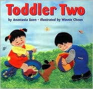
Since I was loosely basing my storytime on the number two, I used an older title that we had in our storytime collection. I'd never used this board book before (we have multiple copies so that each child and caregiver can follow along in their own copy), but I certainly will again! Toddler Two is by the very kind and friendly, Anastasia Suen - author, teacher, consultant, and organizer of our weekly Nonfiction Monday roundups.
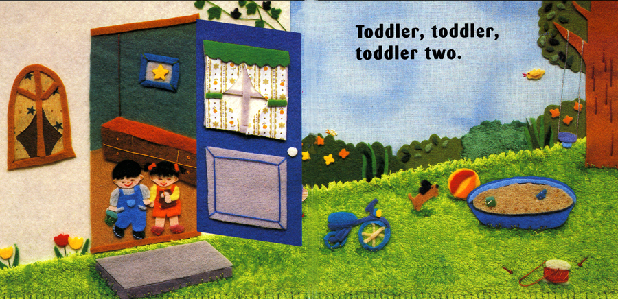
The simple words, beautifully detailed felt art, and collection of commonplace items (tricycle, dog, ball, sandbox) make this a picture-perfect picture book for sharing with toddlers.
First up - Cynthia Rylant's newest series, Brownie & Pearl. Although today I used Brownie & Pearl Step Out, I'll feature her latest, Brownie & Pearl Grab a Bite.
- Rylant, Cynthia. 2011. Brownie & Pearl Grab a Bite. Ill. by Brian Biggs. New York: Beach Lane.
Personally, I love that Brownie eats string cheese (enjoying the peeling as much as the eating) and that she bites her Saltines into shapes.
Since I was loosely basing my storytime on the number two, I used an older title that we had in our storytime collection. I'd never used this board book before (we have multiple copies so that each child and caregiver can follow along in their own copy), but I certainly will again! Toddler Two is by the very kind and friendly, Anastasia Suen - author, teacher, consultant, and organizer of our weekly Nonfiction Monday roundups.
- Suen, Anastasia. 2002. Toddler Two. Ill. by Winnie Cheon. New York: Lee and Low.
The simple words, beautifully detailed felt art, and collection of commonplace items (tricycle, dog, ball, sandbox) make this a picture-perfect picture book for sharing with toddlers.
Q: Can it be that Cynthia Rylant doesn't have a website?
Friday, June 17, 2011
Tales for Very Picky Eaters: a review
If you read my blog often (and thanks if you do), you'll know that I don't normally get excited over chapter books. It's hard to break new ground or do much "outside the box," with a beginning reader or chapter book (unless you're Mo Willems).
Tales for Very Picky Eaters doesn't break new ground - it's the standard chapter book size, 48 pages long, and contains five short illustrated chapters that can stand alone, but tie together in a neat little story. So why do I like Tales for Very Picky Eaters? Begin with the chapter titles - sure to please the most reluctant or recalcitrant reader. Each is a tale - "The Tale of the Disgusting Broccoli," "The Tale of the Smelly Lasagna," and my personal favorite, "The Tale of the Repulsive Milk" (never have been a fan of milk!). But what truly makes this book different is Schneider's very dry sense of humor.
Take the "Tale of the Lumpy Oatmeal."
"I can't eat oatmeal," said James. "It's lumpy."James' dad goes on to explain that if they don't eat the oatmeal, it will keep growing and growing.
"Okay," said James's father.
"Okay?" asked James.
"Okay," James's father said again. "We just need to be extra careful from now on."
"Why?" asked James.
"Well, I got a great deal at the store. They were selling Growing Oatmeal. You can eat a bowl of oatmeal for breakfast and it will grow right back overnight. We'll never run out. It will just keep growing and growing."
"And growing oatmeal has quite an appetite. It will start eating the other foods."Growing Oatmeal is apparently fond of cake and ice cream, and
"we will have to keep a close eye on the dog because Growing Oatmeal is not a very picky eater."(cue the devoted Basset Hound here, looking mournful with a framed photo in his mouth, featuring himself with James - no words necessary)
"Could you make some oatmeal with fewer lumps?" James asked.Kids will get this kind of humor and I predict they'll like it. Slimy eggs, anyone?
"Why certainly," said James's father.
Wednesday evening my son graduated from 8th grade, Thursday evening, my eldest daughter graduated from high school. It's been a busy time for me, hence my sporadic posts. Next week, I'll be off to ALA in New Orleans for the annual conference. I, and several others will be microblogging from New Orleans for ALSC. Be sure to check out the ALSC Blog!
Monday, April 18, 2011
Time for a Bath, Time to Eat
It's Nonfiction Monday again! (where does the week go?)
Just a short post today because I'm on vacation.
I'll try to post a photo or two later in the week and perhaps you can guess where I am.
Here's a hint: It's a great town for baseball and ducklings. Feel free to make a guess in the comments.
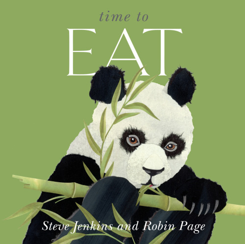
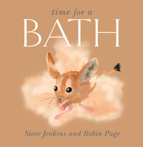
Here are two great new offerings from the talented duo of Steve Jenkins and Robin Page.
Time to Eat and Time for a Bath. 2011. Boston: Houghton Mifflin.
Illustrated in typical Steve Jenkins style, these small (81/4" square), attractive books feature the ways in which various animals eat and bathe. The facts presented are particularly interesting, especially for young children,
Got milk? Like all mammals, the baby blue whale drinks milk. A lot of milk - the equivalent of 800 glasses every day. On this rich diet, a young whale can gain 200 pounds 991 kilograms) every twenty-four hours.Don't want to take a bath? How about a shower?
Rainy day bath The hummingbird takes its bath on a rainy day, perching on a branch and spreading its wings in a downpour.The final pages include lengthy paragraphs of general information on each featured animal.
There is a third book in this series, Time to Sleep, but my branch did not have a copy. I'm sure it's great as well.
Today's roundup is at The Cat and the Fiddle.
Stop by and check out all of today's Nonfiction Monday posts.
Monday, January 3, 2011
Food is Categorical
When I was a child, life was simpler. There were four food groups - dairy, fruits/vegetables, grains, and proteins. (Although I was always insistent that there was also a dessert category) Then in 1992, a food pyramid was introduced. It was constructed similarly to an Egyptian pyramid, with foods as the building blocks for good health. It didn’t last nearly as long as its four food group predecessor, and was replaced by the current My Pyramid in 2005. The new pyramid, pictured below, looks more like a Maypole with ribbons of color suggesting the food categories. Boring, right? Well, if you’re bored by it all, imagine how kids feel about the topic!
Enter the CATegorial cats to help out.
Food is CATegorical is the name of a new seven book series featuring the main food groups and healthy living. I read two of the new books.
These are not the books that children will come looking for, but I’m betting that teachers will be whisking them off my shelves and into the classroom. If your goal is to teach healthy eating and the food pyramid -- like prunes, these books will get the job done.
Coloring sheets, games and other activities related to the Food is CATegorical series are available on the author’s website.
Today’s Nonfiction Monday is at Charlotte’s Library.
Share |
Enter the CATegorial cats to help out.
Food is CATegorical is the name of a new seven book series featuring the main food groups and healthy living. I read two of the new books.
- Cleary, Brian P. 2011. Apples, Cherries, Red Raspberries: What is in the Fruits Group? Ill. by Martin Goneau. Minneapolis, MN: Millbrook.
- Cleary, Brian P. 2011. Macaroni and Rice and Bread by the Slice: What is in the Grains Group? Ill. by Martin Goneau. Minneapolis, MN: Millbrook.
Bananas are cool ‘cause they’re packaged in peels. They’re equally good on desserts or with meals. Whether on cereal or with your lunch, this fruit’s sure to pack a potassium punch!The rhymes are accompanied by lively and humorous cartoon illustrations of cats. On one page, a cat is whistling on his way to the bathroom. A bowl of fruit is on the table. Dressed in a robe and slippers and carrying a newspaper under his arm, he’s accompanied by this rather graphic rhyme,
A plum or a prune or some nice honeydew -
all these will help us to go “number two.”Each book concludes with the proper amount of that should be eaten (for grains, 5-6 ounces per day), and illustrations of portion sizes (1 slice whole wheat bread equals 1 ounce).
These are not the books that children will come looking for, but I’m betting that teachers will be whisking them off my shelves and into the classroom. If your goal is to teach healthy eating and the food pyramid -- like prunes, these books will get the job done.
Coloring sheets, games and other activities related to the Food is CATegorical series are available on the author’s website.
| The current USDA food pyramid |
Today’s Nonfiction Monday is at Charlotte’s Library.
Share |
Friday, September 17, 2010
September Picture Book Roundup
Here we go with another picture book roundup -
a selection from the three bags just received at my branch.
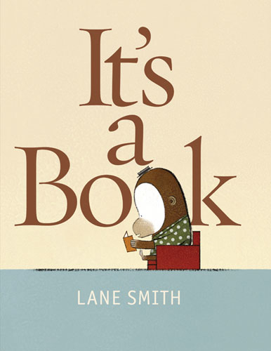
Smith, Lane. 2010. It's a Book. New York: Roaring Brook.
Can it text? Blog? Scroll? Wi-Fi? Tweet? No. It's a book.Not quite appropriate for school visits (!) , but it may be the funniest picture book you'll read this year! I can't stop laughing!
Wright, Michael. 2010. Jake Goes Peanuts. New York: Feiwel.
This one was on hold and left the branch on the same day it arrived. I can see why some young peanut butter-loving child is anxious to read this one! Hilariously droll illustrations and a delightfully funny story about a boy who wants to eat nothing but peanut butter. Luckily (?) for him, his parents decide to oblige, making everything out of peanut butter,
They dipped peanut butter crackers in their peanut butter soup. Jake was eating so much peanut stuff, he made peanut butter poop.A rhyming romp of peanuty fun! Allergies? No worries. There's a "Peanut-Free Zone" at the school!
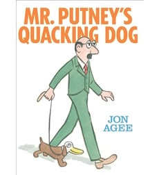
Agee, Jon. 2010. Mr. Putney's Quacking Dog. New York: Scholastic.
It's hard not to like Jon Agee. His illustrations are classic, and he's got a great sense of humor. Mr. Putney's Quacking Dog, however, may be just a little too difficult for most kids to "get." The reader is introduced to Mr. Putney's animal friends, and has to guess the animal's name based on the illustrations and a short question,
Which friend of Mr. Putney's has cold feet?
A SOCKTOPUSThe illustration does show Mr. Putney preparing to dive into the water carrying a large flower-sized box, and the chilly octopus is partially visible in the water, but I have to admit, I didn't guess "socktopus," before I turned the page (and that's one of the easier jokes). As a matter of fact, in a quick run-through of the book, I only "got" 6 of the 20 jokes. If you're planning to read this one at storytime, be prepared to give plenty of hints! Cute.
Frazee, Marla. 2010. The Boss Baby. New York: Beach Lane.
This baby is no little bundle of joy! He’s the boss, and Mom and Dad know it! He runs the home like a tyrant - no time off, plenty of meetings, and round-the-clock demands. He wants his perks too - time at the spa and the gym, drinks made to order. When Mom and Dad are finally too worn out to comply with boss’s orders, something very surprising occurs! The illustrations of the business-suited little tyrant (complete with diaper hatch!) add hilarity to an already funny book. Delightful!
and finally, a more thoughtful book ...
Raschka, Chris. 2010. Little Black Crow. New York: Atheneum.
A little boy sits on a fence and wonders about a passing crow,
Little black crow where do you go? Where do you go in the cold white snow? Where do you go?Through the boy’s series of poetically repetitive questions, we learn about the little black crow, but ultimately, more about the boy who questions it,
Do you ever worry when you hop and you hurry? Are you ever afraid of mistakes you’ve made? Are you never afraid?Raschka’s watercolor illustrations evoke the simplicity and wonder of childhood. Enchanting.
Share |
Tuesday, April 8, 2008
Bee-Bim Bop!
Bee-Bim Bop!Park, Linda Sue. 2005. Bee-Bim Bop! Ill. by Ho Baek Lee. New York: Clarion.
ISBN 13: 9780618265114.
PLOT SUMMARY
What does a hungry little girl want for dinner? Bee-bim bop! A little girl can hardly wait as she helps Mama purchase ingredients and prepare bee-bim bop, a traditional Korean dish, for her family. The process is as much fun as the result!
CRITICAL ANALYSIS
Bee-Bim Bop! is a delightful story for young audiences. The text reflects the fast-paced urgency of a hungry child in an upbeat rhyming rhythm, "Hurry, Mama, hurry Gotta chop chop chop! Hungry - very hungry for some bee-bim bop!" The "Hurry, Mama, hurry" refrain is repeated often. In addition to pure fun, Bee-Bim Bop! will give children a sense of possibility and capability, "Spinach, sprouts, and carrots Each goes in a pan, Let me pour the water in Yes, I know I can!" and"Bowls go on the table Big ones striped in blue I help set the glasses out Spoons and chopsticks too." Adding interest and excitement is the concrete presentation of verbs pertaining to cooking. The "flip-flip flop" of the egg pancakes bounces in the midst of the text. "Chop chop chop" appears on a hard 45 degree slant, much as a chopping blade in motion.The book is also an excellent example of a Korean American multicultural story with its roots set firmly within the United States. The child's family, illustrated by Ho Baek Lee, has the common characteristics of Asian Americans - tan skin tones, straight black hair and a characteristic eye shape, however, the features are never exaggerated and the family is portrayed as any other typical US family, complete with a frisky dog. The grocery store and kitchen setting, as well as the clothing are typically American. The focus is on the young girl, with Mama's head frequently missing from the double-page illustrations. The dog also is featured prominently, following the young girl throughout the kitchen. The colors are bright, but realistic. The overall impression of the cheerful watercolor and pencil illustrations is one of a happy and playful family.The topic of the book, is of course, distinctively Korean American, as is the use of chopsticks. Grandma is the only family member that appears decidedly Korean, wearing a traditional garment, with her hair fixed neatly in a bun with a decorated ornament. The fact that the entire family wears slippers while indoors may also be indicative of Asian American culture. In a nod to biculturalism, the family (except the dog, who keeps one eye fixed upon the bee-bim bop!) closes their eyes and bows their heads to say grace before dinner.The book concludes with a recipe for bee-bim bop, divided into tasks for "grownups" and "you." An Author's Note explains bee-bim bop and is accompanied by a photograph of the author and her young relatives preparing dinner. This book will surely ignite a desire to hurry hurry hurry to the kitchen to make some bee-bim bop!
CONNECTIONS
Read Bee-Bim Bop! with The Trip Back Home by Janet S. Wong, and Ill. by Bo Jia. The Trip Back Home includes a trip to the market and the preparation of a meal in a modern, rural Korean household. Many of the ingredients mentioned are the same as those in the dish, bee bim bop. It offers an excellent example of how traditions are brought to the United States and adapted.This is an excellent choice for a public library storytime. Preschoolers will love it!Share this story with a globe. Let children find bee-bim bop's home, Korea, on the globe.
ISBN 13: 9780618265114.
PLOT SUMMARY
What does a hungry little girl want for dinner? Bee-bim bop! A little girl can hardly wait as she helps Mama purchase ingredients and prepare bee-bim bop, a traditional Korean dish, for her family. The process is as much fun as the result!
CRITICAL ANALYSIS
Bee-Bim Bop! is a delightful story for young audiences. The text reflects the fast-paced urgency of a hungry child in an upbeat rhyming rhythm, "Hurry, Mama, hurry Gotta chop chop chop! Hungry - very hungry for some bee-bim bop!" The "Hurry, Mama, hurry" refrain is repeated often. In addition to pure fun, Bee-Bim Bop! will give children a sense of possibility and capability, "Spinach, sprouts, and carrots Each goes in a pan, Let me pour the water in Yes, I know I can!" and"Bowls go on the table Big ones striped in blue I help set the glasses out Spoons and chopsticks too." Adding interest and excitement is the concrete presentation of verbs pertaining to cooking. The "flip-flip flop" of the egg pancakes bounces in the midst of the text. "Chop chop chop" appears on a hard 45 degree slant, much as a chopping blade in motion.The book is also an excellent example of a Korean American multicultural story with its roots set firmly within the United States. The child's family, illustrated by Ho Baek Lee, has the common characteristics of Asian Americans - tan skin tones, straight black hair and a characteristic eye shape, however, the features are never exaggerated and the family is portrayed as any other typical US family, complete with a frisky dog. The grocery store and kitchen setting, as well as the clothing are typically American. The focus is on the young girl, with Mama's head frequently missing from the double-page illustrations. The dog also is featured prominently, following the young girl throughout the kitchen. The colors are bright, but realistic. The overall impression of the cheerful watercolor and pencil illustrations is one of a happy and playful family.The topic of the book, is of course, distinctively Korean American, as is the use of chopsticks. Grandma is the only family member that appears decidedly Korean, wearing a traditional garment, with her hair fixed neatly in a bun with a decorated ornament. The fact that the entire family wears slippers while indoors may also be indicative of Asian American culture. In a nod to biculturalism, the family (except the dog, who keeps one eye fixed upon the bee-bim bop!) closes their eyes and bows their heads to say grace before dinner.The book concludes with a recipe for bee-bim bop, divided into tasks for "grownups" and "you." An Author's Note explains bee-bim bop and is accompanied by a photograph of the author and her young relatives preparing dinner. This book will surely ignite a desire to hurry hurry hurry to the kitchen to make some bee-bim bop!
CONNECTIONS
Read Bee-Bim Bop! with The Trip Back Home by Janet S. Wong, and Ill. by Bo Jia. The Trip Back Home includes a trip to the market and the preparation of a meal in a modern, rural Korean household. Many of the ingredients mentioned are the same as those in the dish, bee bim bop. It offers an excellent example of how traditions are brought to the United States and adapted.This is an excellent choice for a public library storytime. Preschoolers will love it!Share this story with a globe. Let children find bee-bim bop's home, Korea, on the globe.
Subscribe to:
Posts (Atom)
Beneath the Waves - a review
As we read disturbing news accounts of dying manatees , environmental disasters caused by toxic waste, and ocean pollution on the scale of ...
-
I'm delighted to host today's Nonfiction Monday. My contribution for today is Marc Aronson's If Stones Could Speak: Unlocking th...
-
Welcome to Shelf-employed! I'm the host of this week's Nonfiction Monday . Grubman, Steve and Jill Davis. 2010. Orangutans are Tic...
-
Gutman, Dan. 2012. Election! A Kid's Guide to Picking our President. New York: Open Road Media. Advance copy provided by NetGall...